Material Design
Material Design (codenamed Quantum Paper)[1] is a design language developed by Google in 2014. Expanding on the "cards" that debuted in Google Now, Material Design uses more grid-based layouts, responsive animations and transitions, padding, and depth effects such as lighting and shadows. Google announced Material Design on June 25, 2014, at the 2014 Google I/O conference.
 | |||||||||
 Material Design 3 on Android 12 | |||||||||
| Developer(s) | |||||||||
|---|---|---|---|---|---|---|---|---|---|
| Initial release | June 25, 2014 | ||||||||
| |||||||||
| Written in | HTML, CSS, Sass (v4), JavaScript, AngularJS, Angular, Java, Objective-C, Swift, Dart | ||||||||
| Platform | Android, iOS, Web | ||||||||
| Type | Design language software | ||||||||
| License |
| ||||||||
| Website | Latest Version
Archived Versions | ||||||||
The main purpose of Material Design is the creation of a new visual language that combines principles of good design with technical and scientific innovation. Designer Matías Duarte explained that, "unlike real paper, our digital material can expand and reform intelligently. Material has physical surfaces and edges. Seams and shadows provide meaning about what you can touch." Google states that their new design language is based on paper and ink but implementation takes place in an advanced manner.[2][3][4]
In 2018, Google detailed a revamp of the language, with a focus on providing more flexibility for designers to create custom "themes" with varying geometry, colors, and typography. In 2021, a further evolution of the design language, titled Material You, was unveiled.[5]
Implementation
Material Design was to be gradually extended throughout Google's array of web and mobile products, providing a consistent experience across all platforms and applications. Google has also released application programming interfaces (APIs) for third-party developers to incorporate the design language into their applications.[6][7][8]
The canonical open source implementation of Material Design for web application user interfaces is called Material web.[9]
Updates


Material Design 2 (Google Material Theme)
After the 2018 revamp, Google began redesigning most of their apps into a customized and adapted version of Material Design called the Google Material Theme,[10] also dubbed "Material Design 2",[11] which heavily emphasizes white space, rounded corners, colorful icons, bottom navigation bars, and utilizes a special size-optimized version of Google's proprietary Product Sans font called Google Sans.[12]
Material Design 3 (Material You)
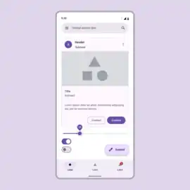
At Google I/O in May 2021, Google announced a new concept on Android 12 known as "Material You" (also known as "Material Design 3"[13]), emphasizing increased animation, larger buttons, and the ability for custom UI themes to be generated from the user's wallpaper.[5] Material You was gradually rolled out to various Google apps on older Android versions in the following months, and acted as a major focus on the Pixel 6 and Pixel 6 Pro smartphone series.[14][15][16]
See also
References
- "Exclusive: Quantum Paper And Google's Upcoming Effort To Make Consistent UI Simple". Techcrunch. 11 June 2014. Retrieved 11 June 2014.
- "Google's new 'Material Design' UI coming to Android, Chrome OS and the web". Engadget. Retrieved 26 June 2014.
- "Google's New, Improved Android Will Deliver A Unified Design Language". Co.Design. 25 June 2014. Retrieved 26 June 2014.
- "Google Reveals Details About Android L at Google IO". Anandtech. Retrieved 26 June 2014.
- Bohn, Dieter (2021-05-18). "Android 12 preview: first look at Google's radical new design". The Verge. Retrieved 2021-05-19.
- Chris Smith (30 July 2014). "Google's Material Design is about to change the way we look at the worldwide web". BGR.
- "We just played with Android's L Developer Preview". Engadget. AOL. Retrieved 26 June 2014.
- "Google's next big Android redesign is coming in the fall". The Verge. Vox Media. 25 June 2014. Retrieved 26 June 2014.
- "Web – Material Design 3". Archived from the original on 2023-09-08.
- "Material Design". Material Design. Retrieved 2020-09-06.
- Hall, Stephen (2018-04-26). "What exactly is this so-called 'Material Design 2,' and what will it look like?". 9to5Google. Retrieved 2020-09-06.
- Hall, Stephen (2018-05-09). "Now we know: Google Sans is actually a size-optimized version of Product Sans". 9to5Google. Retrieved 2020-09-06.
- Material Design [@materialdesign] (October 27, 2021). "🎊 The latest in Material Design is NOW available. With Material Design 3, our next generation of the system, we're introducing Material You — a new set of features that help make your apps more personalized. Give it a try → goo.gle/m3-material-io #AndroidDevSummit" (Tweet). Retrieved October 27, 2021 – via Twitter.
- Warren, Tom (September 10, 2021). "Google's Material You design is coming to Gmail, Calendar, and Docs on Android". The Verge. Retrieved September 19, 2021.
- Li, Abner (September 15, 2021). "Google Photos rolling out Material You redesign, but without Dynamic Color". 9to5Google. Retrieved September 19, 2021.
- "Google Contacts is already getting its Material You UI makeover". Android Police. 2021-07-29. Retrieved 2021-09-19.