Joanna (typeface)
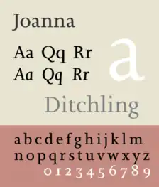
Joanna is a serif typeface designed by Eric Gill (1882–1940) from 1930 to 1931 that was named for one of his daughters. Gill chose Joanna for setting An Essay on Typography, a book by Gill on his thoughts on typography, typesetting and page design.[1] He described it as "a book face free from all fancy business".[2]
 | |
| Category | Serif |
|---|---|
| Classification | Various; slab |
| Designer(s) | Eric Gill |
| Foundry | Monotype (general release) |
| Variations | Joanna Nova (shown) Joanna Sans |
Design
Joanna is based on the traditional old-style serif model of the Renaissance. However, the spare, sharp squared serifs and minimal contrast of strokes give the design a 20th-century modernist feeling, reminiscent of the Didone and slab serifs of the nineteenth century but far lighter than most typefaces of this genre. This is very similar to Gill's earlier typeface Solus, also rather light and monoline with horizontal serifs similar to Monotype's pre-existing Bodoni 135 typeface.[2][lower-alpha 1] (Solus was never particularly popular, perhaps because it did not have an italic.[lower-alpha 2])
Many of the letter forms of Joanna are characteristic of Gill's preferences, for example the lack of serif on the top left of the 'a', the splayed leg of the 'R' and handwriting-like italic 'g', with many similarities to his stonecarving and also to his other serif typefaces, Cockerel and Perpetua, for example in its handwriting-style italic 'g'.[3][7] The italics are more vertical than traditional, with only a slope of about 3°: indeed, in the original cut Gill did not bother to have italic capitals created, simply using the upright ones.[8][6][lower-alpha 3] The 'f', too, does not descend below the baseline.

History
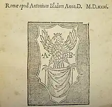
The typeface was originally designed for proprietary use by Gill's printing shop Hague & Gill, run with his son-in-law René Hague.[11] The type was first produced in a small quantity by the Caslon Foundry for hand composition. In the metal type version, Gill used two sizes of capitals, one to ascender height and one below it that could be used as preferred depending on how strong the capitals were intended to appear.[4]
Later around 1937, Monotype recut Joanna for their hot metal typesetting system for exclusive use by publisher J. M. Dent. It was eventually licensed for public release by Monotype in 1958, after Gill's death, when J.M. Dent's exclusivity expired. It was first shown in the Monotype Recorder in 1958, accompanied by an exhibition on his work.[2][4]
Once released widely, prominent users included the Penguin Modern Classics series in their classic blue-grey covers of the 1960s, before they switched to Helvetica.[12] The original metal type, however, was Gill's property, and is now partly in the collection of the Clark Library in Los Angeles.[13][14]
Gill's friend and later bibliographer Robert Harling described it in a 1976 book on Gill's work as innovative in its reduced contrast: "the letter-forms have character and beauty, discipline and gaiety. No other alphabet of this century has managed to make typographical affectation so readable....defiant of almost every typographical canon of the day...Joanna Italic is gaily triumphant."[6]
Joanna Nova
Like several Monotype typefaces digitised in the early digital era, the original digital release was criticised for being too light compared to the real thing, though this effect may be compensated for when printing on poor-quality paper into which ink tends to absorb and spread.[15][16][17]
Monotype released in 2015 a more complete and fuller-bodied digitisation named Joanna Nova (shown), by Ben Jones.[18][19]
All the Monotype versions are somewhat different to the original Caslon type made for Gill, that used in the first edition of An Essay on Typography (historian James Mosley considers it as superior to Monotype's, and Vivian Ridler also felt the Monotype version in some ways less characterful than the metal),[4] and Jones described his goal as being to compromise between the different versions "to create a version of Joanna that appears in your mind when you think of Joanna."[20][21]
The family includes 18 fonts in 9 weights and 2 weights, with complementary italics. Character set support includes W1G.
Related typefaces
 | |
| Category | Sans-serif |
|---|---|
| Classification | Humanist |
| Designer(s) | Terrance Weinzierl |
| Foundry | Monotype |
Joanna Hellenic (1998)
Joanna Hellenic is a Greek version of Joanna designed by Hector Haralambous.
The family includes 7 fonts in 4 weights and 1 width, with complementary italics on all but the heaviest weight.
Joanna Sans Nova (2015)
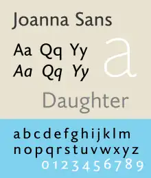
Monotype released Joanna Nova in 2015 with a matching sans-serif design by Terrance Weinzierl, Joanna Sans Nova, intended to somewhat resemble Gill Sans but complement Joanna more closely, with a more normally slanted italic not solely inspired by either.[22]
The family includes 16 fonts in 8 weights and 2 weights, with complementary italics. Character set support includes W1G.
FF Scala (1990)
One of the typefaces most influenced by Joanna is FF Scala, designed in 1990 by the Dutch type designer Martin Majoor and released by FontFont. It is similar in its geometric simplicity combined with the old-style letterform.[23] Majoor created a complementary sans-serif design, FF Scala Sans. The resulting font superfamily was one of the first such designs to be popular, and remains common in book printing.[24]
Joanna is the corporate typeface of the United States' Department of Homeland Security, while Scala is used on its seal.[25][26]
Notes
- James Mosley describes Solus as "essentially a mechanistic type — a ‘light Egyptian’", a description also reached by Robert Harling and Vivian Ridler.[3][4] Walter Tracy in contrast commented: "it is hard to accept the suggestion that the egyptian form was in Eric Gill's mind...[Solus] is really no more than a Perpetua-like roman unhappily fitted with a thickened version of the serifs of Monotype Bodoni 135, recommended to Gill by Stanley Morison."[5]
- Harling assesses it as having failed to appeal for lack of differentiation from Perpetua in small sizes, and lacking the 'aggressive qualities' of display-focused slab serifs in larger ones.[6]
- This is actually the original form of italics: until the later sixteenth century, capitals remained upright. This makes sense given historical precedent, as italics derive from slanted handwriting but capital letters from upright Roman square capitals. A famous example of this style of italic with upright capitals is the work of Arrighi in Rome, which also inspired French printers of the sixteenth century.[9]
Bibliography
- Bringhurst, Robert. The Elements of Typographic Style. Hartley & Marks: 1992. ISBN 0-88179-033-8.
- Dodd, Robin. From Gutenberg to Open Type. Hartley & Marks: 2006. ISBN 0-88179-210-1.
- Friedl, Frederich, Nicholas Ott and Bernard Stein. Typography: An Encyclopedic Survey of Type Design and Techniques Through History. Black Dog & Leventhal: 1998. ISBN 1-57912-023-7.
- Kindserley, David. Mr. Eric Gill: Further Thoughts by an Apprentice. Cardozo Kindersley Editions: 1967, 1982. ISBN 0-9501946-5-4.
References
- "An Essay on Typography". David R. Godine, Publisher. Archived from the original on 16 March 2015. Retrieved 21 April 2015.
- "Eric Gill: Monotype Recorder special issue" (PDF). Monotype Recorder. 41 (3). 1958. Retrieved 6 November 2015.
- Bates, Keith. "The Non Solus Story". K-Type. Retrieved 21 July 2015.
- Ridler, Vivian. "Three New Book Faces". Motif (1): 76–9.
[Joanna's] most obvious characteristics are the comparatively even weight, slab serifs and generous width. Gill had already used the slab serif in Solus...the only other text type known to me in which the slab serif is used with any sense of style is Candida by Jakob Erbar...but apart from certain of the capitals, Candida suffers badly by the comarison...Joanna is a desirable type, even though the italic may be more mannered than the general public will readily accept.
- Tracy, Walter. Letters of Credit. p. 82.
- Harling, notes by Robert (1975). The Letter Forms and Type Designs of Eric Gill ([1st U.S. ed.]. ed.). Westerham, Kent: Published by Eva Svensson, and printed by the Westerham Press. pp. 51–8. ISBN 0-903696-04-5.
- "ITC Golden Cockerel". MyFonts. ITC. Retrieved 30 August 2015.
- Mosley, James (November 10, 2015). Lecture on Gill's work (Speech). 'Me & Mr Gill' talk. Old Truman Brewery, London.
- Dearden, James (1973). Encyclopedia of Library and Information Science: Claude Garamond. New York u.a.: Dekker. pp. 196–199. ISBN 978-0-8247-2109-1. Retrieved 11 December 2015.
- Vervliet, Hendrik (2005). "Early Paris Italics: 1515-1545". Journal of the Printing Historical Society (8): 5–55.
- Hardwig, Florian (23 April 2016). "The Sonnets of William Shakespeare, Cassell & Company Ltd". Fonts in Use. Retrieved 20 October 2016.
- Hardwig, Florian (22 March 2013). "Brave New World 1965 Penguin edition". Fonts In Use. Retrieved 20 September 2015.
- Aid for the Collection on Eric Gill, 1887–2003.
- Morris, Sallie (November 6, 2015). Lecture on Gill's typefaces (Speech). 'Me & Mr Gill' talk. Old Truman Brewery, London.
- Thomson, Mark. "Visions of Joanna". Eye Magazine. Retrieved 7 July 2015.
- Matteson, Steve. "Type Q&A: Steve Matteson from Monotype". Monotype. Retrieved 4 July 2015.
- Kobayashi, Akira. "Akira Kobayashi on FF Clifford". FontFeed. Retrieved 1 July 2015.
- "Details for Joanna Nova font family at Linotype.com". Monotype GmbH. Retrieved 31 October 2015.
- Walters, John; Jones, Ben. "Ben Jones: Restoring what Joanna lost". Monotype. Retrieved 14 August 2018.
- Mosley, James (2001). "Review: A Tally of Types". Journal of the Printing History Society. 3, new series: 63–67.
Monotype Joanna is crudely drawn by comparison with the original type made for Gill - without any intervention from Morison so far as one can tell - by the Caslon foundry.
- Jones, Ben. "Joanna Nova". MyFonts. Monotype. Retrieved 16 February 2016.
- Weinzierl, Terrance. "Joanna Sans Nova MT". MyFonts. Monotype. Retrieved 6 November 2015.
- "Martin Majoor Type Design".
- Coles, Stephen. "Top Ten Typefaces Used by Book Design Winners". FontFeed. Archived from the original on 28 February 2012. Retrieved 2 July 2015.
- "Seal and Signature usage guidelines" (PDF). DHS. US government. Retrieved 7 July 2015.
- Coles, Stephen (16 April 2013). "Fonts in use: Scala". Fonts in Use.
External links
- Joanna Nova
- Joanna Sans Nova
- Monotype Imaging's web page on the first Joanna digitisation; small caps in regular and semi-bold styles
- Non Solus (unofficial revival of Joanna's predecessor with added italic similar to Joanna's; no small caps, medium roman weight available as trial)
- First showing (printed by Hague & Gill)
- Sample of Joanna in metal type
- Flyer advertising the original release of Joanna
- First showing in Monotype Recorder, 1958