|
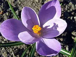 Purple Crocus: 293x220 pixels |
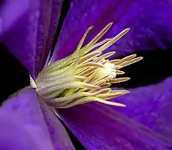 Clematis: Hybrid; 251x220 pixels | ||
Images in Containers
Images in a table
n-line, tiled images are simple to do, though they lack the positional stability of images in table cells. Although the matter rarely becomes important for images placed at the left or right of a page, when a more ambitious layout is needed, tables come into their own.
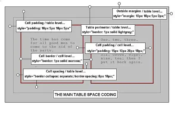
Tables allow many formatting options but do require some knowledge of Wiki's table-making code. To learn how to make tables see the page Tables, and to remind yourself of the styles used, see the drop-box later on this page.
After trying different methods, it is found best to use a table with two rows; one for the images, and the row below that for their captions. This allows the captions to be formatted separately from anything in the image cells and generally gives the best flexibility in working. When table borders are removed in such an arrangement, the images seem to stand on their own without the table being visible at all. The first example below uses this method, with the mark-up code for its implementation shown nearby.
To space out the images across the page against the prevailing background it is best to add extra columns to the tables. Do this by adding extra cells in the existing rows, and set their widths to achieve the necessary spacings. To avoid the need for additional styling of the table's background it can be made transparent. In this way the page color shows though, regardless of what color is set. An example using these points is shown, and the code to produce it is also displayed nearby.
For those who find tables a bit awkward to use, the image gallery may be more to their liking. It is much simpler, and quite good results are to be had without formatting. It is described below with varying complexity.
 |
 |
 |
 |
| Aegopodium podagraria | Adam and Eve Dactylorhiza sambucina | Alisma plantago-aquatica | Antennaria dioeca |
|
|
|
|
|||||
| Aegopodium podagraria | Adam and Eve Dactylorhiza sambucina | Alisma plantago-aquatica | Antennaria dioeca |
|
|
|
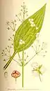
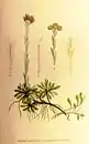
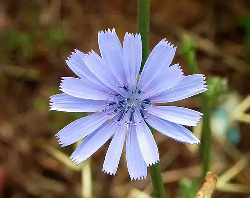
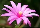
In addition, the images at the top of this article are both housed in table cells, with the table of contents, (TOC), in another; this was deemed necessary to constrain the positioning of the TOC in its various contortions. The code can be found in the drop-down box and if required, can be pasted into an editing window, or the Sandbox for modification. For those who are unfamiliar with table handling, a set of templates, Imageontop, Image1ontop, Image2ontop, and Image3ontop,have been prepared and allow the user to make similar top sections to the one on this page. If the requirement is just for a table of contents with text all the way to the top, then use the template Textontop.
The Image Gallery
onsider the three image gallery examples in the drop-down box. In the most simple example of its use, the user need not even scale the images, and need not know their sizes. The software makes all of the calculations and adjusts all of the dimensions to fit the images neatly into the gallery layout. Captions are available for both the images and the gallery itself, and any reasonable number of images can be added, with each image's coding typed onto a separate line. If required, a small amount of text can be inserted instead of an image.
The first example is the simplest and is ordered in rows of four images. This four-to-a-row format is provided by default, but can be adjusted as will be shown in the second example. Blank places are left for any unused image space in a row, e.g.; for a gallery of seven images, there would be one blank space in the second row. Although this gallery uses an HTML align attribute in an attempt to center it, centering has failed within the drop-box and it merely appears to be centered because it is the widest inclusion, and has simply been expanded to the size that is needed by this block element.
There are problems with the centering of the gallery function within a drop-box, though not necessarily when galleries are used on the open page. The problem seems to be connected with the use of the HTML align attribute. It is likely that a CSS style in a style sheet has invoked a priority in drop-boxes over the use of an HTML attribute. However there is a way to overcome the problem within a drop-box; in the second example below the HTML align attribute has been replaced by CSS styles for width and margin, and the use of this alternative styling overcomes the problem. The method can use percentages as dimensions to allow for different container (screen) widths, but the styles need careful adjustment for each gallery that is to be displayed. Notice too that whereas the relative percentages for values of width always refer to the immediate container, the values used for margin refer to percentages of the table width. Once the point is understood, there is rarely any confusion.
Note the use of the CSS width style; this allows an adjustment of the image masks; e.g., by setting a gallery width, any difference between it and the width calculated for the layout, is adjusted by changing the widths of the image masks.
In the second example, row height, column width, and the number of images per row have been added as options. In this way the layout can be changed greatly, and in this particular case, the display made smaller. The position is centered, using CSS styles. Since some viewing screens are narrower than others, reducing the number of images across the gallery with this method helps to keep the whole thing visible at the same time.
In the third example, many other font and formatting options have been added. These formats use many style-sheet rules. (See CSS2 Properties Reference for more). In this way all of the font family, style, color, etc., can be adjusted, as well as the text padding. Some properties remain obstinate; the notion of background color does not extend to the off-white photo mask, but can work on the space between the border and the mask. In addition, some slight difference in appearance for backgrounds has been noted between galleries on a page and galleries in a drop-down box.
The Wikitext markup code used to produce the three results is given in another drop-down box with descriptive notes. The modules can be copied into the Sandbox for further testing and use. Bear in mind that not all of the available text rules have been included. There is some distance still to go in experimenting with useful formats, and some kind soul might even devise a way to expose the photo mask for background coloring.
|


|
Drop-down Images
t can be useful to save space or to un-clutter a page. For all the space saving qualities of tables or the gallery, it can be useful to save even more. An image or even a gallery of images can be tucked away in a drop-down box. The display will appear when the bar is clicked with the mouse; clicking it again closes the control and restores the page to a more tidy state.
For those writing within WikiBooks, there is a template ready-made to make things easy. Refer to Template : Dropimage for its use, limitations, and options. All of the drop-boxes on this page made use of it.
For those who write within Wikipedia there is also a version of Dropimage. In addition, for Wikipedia, Wikimedia, and WikiBooks, there are collapsible tables. See Collapsible Tables, and Tables, for the details.
Whether the enclosure is text, an image, an animation, or a whole gallery of images, the method of using the Dropimage template is the same. The code that will produce the text, image, or gallery is placed in the last parameter space, and the message for the top heading goes into the first parameter. Although it is sometimes found useful to use the named parameter method, (2=parameter text), for most text and images it will be OK to just place the material as it is. If the parameter text is very complicated, it is often a good idea to view it first on its own to make sure it is as expected.
Avoid using Wiki heading codes for your first characters since this messes things up; i.e.; use the HTML <h2></h2> tags instead of the equals signs. If your intention is to place a table in a drop box, be sure that it is an HTML table, since the pipe symbols of a Wiki table might be misinterpreted. Refer to the WikiBooks Template:Dropimage page for an example.
The typical syntax for the Dropimage template and its result are shown below.
{{dropimage|align=center|width=120px|Press me ! |[[image:Animated flower.GIF|200px|center]]''Flower Power''}}
|
When previewed in a page being edited or in the Sandbox , the above code block makes a drop control identical to the one above; the control is centered, has a top caption of Press me !, and an inside caption also. The initial width of the control is 120 pixels, though the image within it is greater, with a base width of 200 pixels. Take time to change the image and the other settings to see how the template works.
WikiBooks templates will work in other projects, such as Wikipedia, provided that they are first imported by their administrator, though in the case of Dropimage it was easier to simply reproduce it there instead.
| Other Pictures Pages |
| The Quick Course Tiled Images |
See also
- Wikibooks:Sandbox – The Wikibooks editing sandbox for users to try their code.
- Help:Editing – How to edit a page
- Help:Files – Working with files
- Editing Wikitext: Tables from this series, and Help:Tables in another piece
- Web colors – The Wikipedia article on web colors
- Wikimedia Commons – The Wikimedia shared media repository
- CSS2 Properties Reference – An excellent external CSS reference
- {{Dropimage}} – A Wikibooks drop-box for images, galleries, or text, with many formatting options.
- {{Hidden}} – Another Wikibooks drop-box
- Description of the <gallery> tag – Information on gallery syntax
- {{Imageontop}} – A Wikibooks template to make a top section with TOC and two images
- {{Textontop}} – A Wikibooks template to make a top section with TOC and text right to the top
- Collapsible Tables – Notes on the basis for drop-controls.
| ||||||||