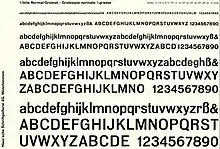
Normal-Grotesk
Normal-Grotesk is a sans-serif typeface that was sold by the Haas Type Foundry (Haas'sche Schriftgiesserei) of Basel and Münchenstein, Switzerland, and popular in Swiss graphic design towards the end of the metal type period in the mid-twentieth century.

As the name suggests, Normal-Grotesk is a “neutral” and functional design on the "grotesque" model popular in nineteenth and twentieth century Germany, with a minimal design lacking decorative features. The typeface is slightly condensed, with almost straight-sided capitals in the regular weight, similar to DIN 1451 and Roboto; the 'r' has a droop and the 'g' is single-storey. Oldřich Hlavsa’s textbook A Book of Type and Design describes it as “a most useful version of the refined display sans-serif, with a perfectly balanced design of the lower-case.”[1]
Around the mid-1950s, a decline in sales took hold of Normal-Grotesk and the Haas Foundry's other grotesque 'Französische Grotesk', as the Akzidenz-Grotesk of Berthold became more popular.[2][3] This led the Haas Foundry to create “Neue Haas Grotesk”, later renamed Helvetica, in response.[4][5]
Indra Kupferschmid, an expert on German and Swiss printing history, describes it as a “reworking of “Neue Moderne Grotesk”, originally ca. 1909 by Wagner & Schmidt, Leipzig. Initially issued by Haas under the name “Accidenz-Grotesk”, later spelled “Akzidenz-Grotesk”. In 1943 Haas added a regular weight offered under the name “Normale Akzidenz-Grotesk”. In 1954, the whole family was revised and renamed “Normal-Grotesk”, also to prevent confusion with [the Berthold Type Foundry’s] Akzidenz-Grotesk.”[6][7] Several characters were reworked to make the forms more contemporary. At the same time, a range of text sizes were made available for the Linotype hot metal typesetting system. Kupferschmid notes that the original design was licensed by Wagner & Schmidt to a number of other European companies, so it "was cast by many European foundries in the early 20th century. Known as Wotan, Neue moderne Grotesk and Edel at Wagner companies/foundries, or – among many others – as Aurora at Weber, Accidenz-Grotesk (later Akzidenz-Grotesk and Normal Grotesk) at Haas, Breite halbfette Grotesk P at Böttger/Berthold, Elite-Grotesk at Poppelbaum, Favorit-Grotesk at Weisert, Moderne Grotesk at AG Schriftguss, Klassische Grotesk at Trennert Altona, Saturn at Schriftguss AG / Brüder Butter, Salon-Grotesk at Stempel, Cairoli from Nebiolo, Scania at Berling, or Grotesca Ideal at Gans (names differ depending on style/weight)."[8]
No official digitisation of Normal-Grotesk has been published as retail typeface so far. As of 2017, it remains commercially available as metal type tooling for bookbinding.[9]
References
- Hlavsa, Oldřich (1960). A Book of Type and Design. New York: Tudor Publishing.
- Kupferschmid, Indra. "The Birth of a Giant". Font Bureau. Retrieved 18 January 2017.
- Kupferschmid, Indra (30 August 2007). "Französische Grotesk Haas". Flickr. Retrieved 18 January 2017.
- Grace Lees-Maffei (8 January 2015). Iconic Designs: 50 Stories about 50 Things. Bloomsbury Publishing. pp. 81–2. ISBN 978-0-85785-353-0.
- Stephen Eskilson (28 February 2012). Graphic Design: A New History, Second Edition. Yale University Press. pp. 290–1. ISBN 978-0-300-17260-7.
- Kupferschmid, Indra (30 August 2007). "Haas Normal-Grotesk". Flickr. Retrieved 18 January 2017.
- Kupferschmid, Indra. "Wagner & Schmidt, etc". kupferschrift. Archived from the original on 19 January 2017. Retrieved 18 January 2017.
- Kupferschmid, Indra (20 August 2015). "Neue moderne Grotesk from Ludwig Wagner". Flickr. Retrieved 18 January 2017.
- "Haas typestyle "Normal Grotesk"". Schmedt. Retrieved 18 January 2017.
External links
- List of styles on the Klingspor Museum website
- Fonts in Use
- Specimen book digitised by Stephen Coles, c. 1954