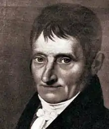
Justus Erich Walbaum
Justus Erich Walbaum (25 January 1768 – 21 June 1837) was a prominent German typefounder and punchcutter of the late 18th and early 19th centuries.[1][2][3][4][lower-alpha 1]
Justus Erich Walbaum | |
|---|---|
 | |
| Born | January 25, 1768 |
| Died | June 21, 1837 (aged 70) |
| Nationality | German |
.png.webp)
Walbaum was a punchcutter, who carved steel punches used as a master to stamp matrices, the moulds used to cast metal type.[8] Walbaum was born in Steinlah, a district of the town of Haverlah in modern Lower Saxony. Based first in Goslar and later in Weimar, he created type in the Didone style, also known as the 'rational' or 'modern' style. This style, inspired by the work of type designers such as the Didot family and Giambattista Bodoni, involved a sharper contrast between thick and thin strokes than was used previously, and a more modular design abstracted from handwriting. Jan Tschichold described his designs as 'the most beautiful German version' of modern type.[9][10] He also created type in the Fraktur style of blackletter.[11]

Walbaum was the son of a clergyman, Johann Erich Walbaum.[2] Initially apprenticed to a grocer and confectioner, he became interested in engraving through working to make moulds for confectionery.[2] After briefly working for the publisher Johann Peter Spehr as an engraver, he received a concession to set up a type-foundry in Goslar in 1796, in 1802 moving it to Weimar where there was more of a market for his work.[2]
Walbaum's original intention was to pass his business onto his son Theodor, who took over its running from 1828, but with the unexpected death of Theodor in July 1836 he sold the concern to the publisher F.A. Brockhaus AG, who later sold materials to H. Berthold AG in 1918.[4][6]
Walbaum's style of type was influential in his lifetime and the following century. It became less popular in the twentieth century due to a change in taste which preferred 'old-style' serif letterforms, based on printing before the nineteenth century, although it was extensively used by the artisanal Curwen Press in London. However, revivals have been created by Monotype, Linotype, Berthold and others in the twentieth century, and by František Štorm more recently.[12][13][14][15]
References
- Bohadti, Gustav (1964). Justus Erich Walbaum: Ein Lebensbild des Graveurs, Stempelschneiders und Schriftgiessers. Staatliches Lehrinstitut für Graphik, Druck und Werbung.
- Bruchmann, Karl G (1959). "Walbaum's early years in Goslar and Weimar". Monotype Recorder. 41 (4): 6–11.
- Alexander S. Lawson (January 1990). Anatomy of a Typeface. David R. Godine Publisher. pp. 202–8. ISBN 978-0-87923-333-4.
- Walter Steiner; Uta Kühn-Stillmark (January 2001). Friedrich Justin Bertuch: ein Leben im klassischen Weimar zwischen Kultur und Kommerz. Böhlau Verlag Köln Weimar. pp. 77–84. ISBN 978-3-412-11097-0.
- Paul Shaw (April 2017). Revival Type: Digital Typefaces Inspired by the Past. Yale University Press. pp. 115–6. ISBN 978-0-300-21929-6.
- Neil Macmillan (2006). An A-Z of Type Designers. Laurence King Publishing. p. 180. ISBN 978-1-85669-395-0.
- Christina Killius (1999). Die Antiqua-Fraktur Debatte um 1800 und ihre historische Herleitung. Otto Harrassowitz Verlag. pp. 24, 459. ISBN 978-3-447-03614-6.
- "The Invention of the Printing Press". French Ministry of Culture. Retrieved 3 December 2015.
- Jan Tschichold (1995). Treasury of Alphabets and Lettering: A Source Book of the Best Letter Forms of Past and Present for Sign Painters, Graphic Artists, Commercial Artists, Typographers, Printers, Sculptors, Architects, and Schools of Art and Design. Norton. pp. 232–3. ISBN 978-0-393-70197-5.
- Simon Garfield (1 September 2011). Just My Type: A Book About Fonts. Penguin Publishing Group. p. 232. ISBN 978-1-101-57781-3.
- Yannis Haralambous; P. Scott Horne (28 November 2007). Fonts & Encodings. "O'Reilly Media, Inc.". p. 394. ISBN 978-0-596-10242-5.
- Tova Rabinowitz (1 January 2015). Exploring Typography. Cengage Learning. p. 107. ISBN 978-1-305-46481-0.
- "Walbaum MT". MyFonts. Monotype. Retrieved 29 February 2016.
- "Walbaum LT". MyFonts. Linotype. Retrieved 29 February 2016.
- Štorm, František. "Walbaum 2010". MyFonts. Stormtype. Retrieved 29 February 2016.
External links
- What Would Justus Do? - presentation by Charles Nix. Shows every page of Walbaum's 1812 specimen from 30:28 onwards
- Specimen issued in the name of his son Theodor. Many typefaces shown are very different to those for which Walbaum was most famous.
- Specimen of Monotype Walbaum with a short history