Grotesque (Stephenson Blake typefaces)
The Stephenson Blake Grotesque fonts are a series of sans-serif typefaces created by the type foundry Stephenson Blake of Sheffield, England, mostly around the beginning of the twentieth century.[1]
 | |
| Category | Sans-serif |
|---|---|
| Classification | Grotesque |
| Foundry | Stephenson Blake |
Stephenson Blake's grotesque faces are in the traditional nineteenth-century "grotesque" style of sans-serif,[2] with folded-up letterforms and a solid structure not intended for extended body text.[3] Forming a sprawling series, they include several unusual details, such as an 'r' with a droop, a bruised-looking 'G' and 'C' with inward curls on the right, very short descenders and considerable variation in stroke width, creating a somewhat eccentric, irregular impression.[4][5][6]
Much less even in colour than later families like Univers and Helvetica, they were very commonly used in British commercial printing in the metal type era, with a revival of interest as part of a resurgence of use of such "industrial" sans-serifs around the 1950s.[7][8][9] Writing in The Typography of Press Advertisement (1956), printer Kenneth Day commented that the family "has a personality sometimes lacking in the condensed forms of the contemporary sans cuttings of the last thirty years."[10] Jeremy Tankard has described them as the "most idiosyncratic of designs".[11] Not all versions have been digitised.
Family
.jpg.webp)
.jpg.webp)
The family of typefaces was sold by number rather than using weight names. Commonly used numbers included:
- Grotesque No. 5 – condensed
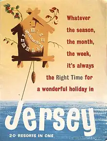
- Grotesque No. 6 – wide[12]
- Grotesque No. 7 – (shown on specimen, above) light condensed
- Grotesque No. 8 – wide, bold.[12]
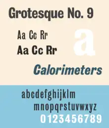
- Grotesque No. 9 – (shown on specimen, above) condensed, bold. Dated to 1906 by Hutchings,[13] it was particularly popular and an oblique was later added in 1949.[13][14] It has been digitised.[4][15][16]
- Grotesque No. 10 – regular weight and width.[17]
- Grotesque No. 66 – wide[18]
Stephenson Blake also used the terms "Condensed" and "Elongated Sans Serif" in some cases.
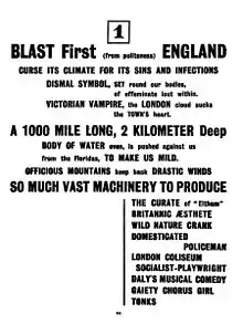
A particularly popular member of the family is Grotesque No. 9, a bold condensed weight, and its companion oblique.[19] Early users of "Grot No. 9" include Wyndham Lewis's 1914 avant-garde magazine Blast.[20][21][22][23][24] It returned to popularity from the 1940s, and an oblique was added in 1949.[14] Colin Banks' 1986 obituary of compositor and advertising designer Bill Morgan credits him and business partner Leon French with the face's revival: "Morgan and French had met doing Ministry of Information propaganda at the London Press Exchange. They had bullied and paid Stephenson Blake, the typefounders, to recall Grot no 9 from historic retirement as they had perceived it as the most economical and powerful letter to exploit the wartime restriction on advertising space."[25] Other designers who liked it included Allen Hutt, who described it in Newspaper Design (1960) as "the best of all Medium Sans, the famous Grotesque No. 9".[26] Grotesque No. 9 reached phototypesetting and Letraset dry transfer lettering and, unlike many of the other Stephenson Blake Grotesques, has been digitised in several releases.[27]
In the United States Roger Black, a prominent publication designer, discovered it in 1972 from a Visual Graphics Corporation phototypesetting catalogue, and came to like it.[4] He used it for designing Newsweek, commissioning a bolder custom redesign from Jim Parkinson, later released commercially.[4][28][29] Font Bureau, the digital typeface design studio he co-founded in 1989, also issued Bureau Grotesque, an adaptation of the whole Grotesque family with a large range of styles, co-designed by the company's other co-founder David Berlow.[4][30][31] Other users have included Q magazine.[32]
The Stephenson Blake Grotesques should not be confused with the first sans-serif font ever made, the capitals-only Caslon Egyptian of c. 1816 which Stephenson Blake sold, which was a quite separate design.
Related fonts


Similar designs include in the metal type period:
- Miller and Richard's similar grotesque family[33]
- Monotype Grotesque–another large family of trade sans-serifs from the British Monotype Corporation
- Headline Bold or Series 595, Monotype's clone of No. 9 with oblique, upright weight digitised.[26][34]
Digital period:
- "Bureau Grotesque" family from Font Bureau, a loose digital adaptation.[30][35][31]
- Balboa by Jim Parkinson with vertical sides on the capitals, inspired by his design for Newsweek but also by a wood type used by the San Francisco Chronicle.[4][28][29] It includes a shaded weight.[36]
- Kilburn by Adrian Talbot, a digital family inspired by the condensed styles.[37][38]
- Sporting Grotesque, a wide open-source family by Lucas Le Bihan loosely inspired by Grotesque No. 6.[39][40]
- Work Sans by Wei Huang, loosely based on Grotesque No. 10 and other wider sans-serifs from the period adapted for onscreen display.[41]
The modern corporate font of Sheffield, Wayfarer designed by Jeremy Tankard, is designed with some influences of the Stephenson Blake Grotesque series but predominantly based on their unrelated sans-serif Granby.[42][43][11]
References
- Stephenson Blake & Co (PDF) (in German). Klingspor Museum. Retrieved 8 October 2016.
- Berry, John. "A Neo-Grotesque Heritage". Adobe Systems. Retrieved 15 October 2015.
- Baines, Phil; Haslam, Andrew (2005). Type & Typography. Laurence King Publishing. p. 73. ISBN 978-1-85669-437-7.
- Shaw, Paul (18 April 2017). Revival Type: Digital Typefaces Inspired by the Past. Yale University Press. pp. 193–4. ISBN 978-0-300-21929-6.
- Dodd, Robin (2006). From Gutenberg to OpenType: an illustrated history of type from the earliest letterforms to the latest digital fonts. Lewes: Ilex. p. 126. ISBN 9781904705772.
- White, Alex W. (6 September 2016). Listening to Type: The Art of Making Language Visible. Skyhorse Publishing Company, Incorporated. p. 572. ISBN 978-1-62153-538-6.
- "Grotesque Type and an Indian Pilot". Thyrsus Press. Retrieved 8 October 2016.
- "Elisha Pechey" (PDF) (in German). Retrieved 8 October 2016.
- Print Design and Production. p. 56.
- Day, Kenneth (1956). The Typography of Press Advertisement. pp. 86–8.
- Tankard, Jeremy. "Wayfarer". Jeremy Tankard Typography. Retrieved 31 July 2016.
Application of the original Granby Condensed type was, however, difficult practically. It was not available in digital form, and felt to be just too condensed, with the proportion of ascender to x-height, too uncomfortable for use on the signing project. So there arose an opportunity to design a new typeface and at the same time tailor it to the specific needs of the Sheffield project. It was also an opportunity to widen the typographic references for the new font. I was keen to look at other early sans serif types, especially those from Stephenson, Blake and most notably their Grotesque series. These most idiosyncratic of designs are full of warmth, have an informal rhythm and a vitality to their shapes, all of which help create interesting word patterns. The rhythm of Wayfarer is similar to that of Granby, but it is combined with an approach to character detailing which echoes the informal variety found in the Grotesques.
- "Grotesque No. 6 & 8 in use – Fonts In Use".
- Hutchings, R. S. (1963). The Western Heritage of Type Design. London: Cory, Adams & Mackay Ltd. pp. 85–7.
- "New-Old Types". Alphabet & Image 8: Stop Press: 2–3. 1948.
We have also seen advance proofs of an italic form to what is probably the most widely used of all the condensed sans serif types, the famous Grotesque Series No 9. The italic version which has long been needed is virtually a sloped roman in accordance with latter-day typographical-doctrinal requirements. Two or three characters have been revised, notably the lower-case a, in order to sort more logically with the roman. The fount which is here set forth is an advance showing, and we are asked by Stephenson Blake to say that the full range of projected sizes will not be ready for a month or so, so please reserve requests until next year.
- "Grotesque No 9 – Webfont & Desktop font « MyFonts".
- "Grotesque No. 9 in use – Fonts In Use".
- Lambert, Frederick W. (1972). Letter Forms: 110 Complete Alphabets. Courier Corporation. pp. 12, 48–9. ISBN 978-0-486-22872-3.
- "Transport Age magazine covers". 1 December 2014.
- Hutt, Allen (1973). The Changing Newspaper: typographic trends in Britain and America 1622–1972 (1. publ. ed.). London: Fraser. pp. 135, 146–7 etc. ISBN 9780900406225.
- Hardwig, Florian (2 March 2017). "BLAST: Review of the Great English Vortex No. 1, by Wyndham Lewis (ed.)". Fonts in Use. Retrieved 2 March 2017.
- Yiannakopoulou, Konstantina. "How BLAST magazine has changed literature". Typeroom. Retrieved 9 October 2016.
- Mattern, Isabelle (13 January 2013). "U5 #3 – Blast/Bless: Grotesque No. 9". Isabelle Mattern (blog). Retrieved 9 October 2016.
- Mattern, Isabelle. "Blast/Bless: Grotesque No. 9". Isabelle Mattern (blog). Archived from the original on 14 October 2016. Retrieved 9 October 2016.
- Leveridge, Michael E. (2000). "The Printing of BLAST". Wyndham Lewis Annual VII (2000). The Wyndham Lewis Society. 7: 20–31. ISSN 0142-6214. Retrieved 27 August 2021.
- Banks, Colin (1986). "Obituary: Bill Morgan". Designer: 9.
- Hutt, Allen. Newspaper Design. Oxford University Press. pp. 110–122.
The best of all Medium Sans, the famous Grotesque No. 9 [is] also available in a full Monotype range, italic as well as roman, designated Headline Bold (Series 595).
- Lamacraft, Jane. "Rub-down revolution". Eye. Retrieved 22 August 2015.
- Parkinson, Jim. "Balboa". MyFonts. Parkinson Type Design. Retrieved 30 April 2017.
- "Balboa Plus User Manual" (PDF). Jim Parkinson. Retrieved 15 April 2023.
- "Bureau Grotesque". Type Network. Font Bureau.
- Schwartz, Christian. "Bureau Grotesque". Christian Schwartz. Retrieved 10 April 2022.
- Cowles, Andy (26 October 2012). "'There are no skeletons in the closet, and I got knighted, so that proves it, doesn't it?'". Coverthink (blog). Retrieved 15 October 2016.
- "Sans-Serifs & Grotesques (Miller & Richard) in use – Fonts In Use".
- "Headline MT". Linotype.com. Retrieved 14 April 2018.
Headline Bold is a sans serif face in the nineteenth century English Grotesque tradition. The Headline Bold font is based on types from the Stephenson Blake type foundry called Grotesque no. 9.
- "Bureau Grot in use – Fonts In Use".
- Parkinson, Jim. "Balboa Shaded". MyFonts. Parkinson Type Design. Retrieved 30 April 2017.
- Coles, Stephen. "New Additions: November 2014". Identifont. Retrieved 9 October 2016.
- Talbot, Adrian. "Kilburn". MyFonts. Talbot Type. Retrieved 9 October 2016.
- Heck, Bethany. "Sporting Grotesque". Font Review Journal. Retrieved 7 January 2018.
- "Sporting Grotesque". Velvetyne. Retrieved 7 January 2018.
- Huang, Wei. "Work Sans". Github. Retrieved 7 January 2018.
Work Sans is a 9 weight typeface family based loosely on early Grotesques — i.e. Stephenson Blake, Miller & Richard and Bauerschen Giesserei...Overall, features are simplified and optimised for screen resolutions – for example, diacritic marks are larger than how they would be in print.
- Bramley, Ellie Violet (13 January 2015). "Subliminal power of city fonts". The Guardian. Retrieved 31 July 2016.
- Tankard, Jeremy. "Commissions: Connect Sheffield". Jeremy Tankard Typography. Retrieved 31 July 2016.
External links
- Stephenson Blake specimen, 1908
- American specimen (photographed by Nick Sherman)
- Grotesque No. 9 (photographed by Stephen Coles)
- Sans of note (Nick Sherman photographs)