Clearface
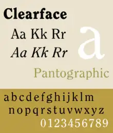
Clearface is a serif typeface designed by Morris Fuller Benton with the collaboration of his father Linn Boyd Benton, produced at American Type Founders in 1907.
 | |
| Category | Serif |
|---|---|
| Designer(s) | Morris Fuller Benton Linn Boyd Benton |
| Foundry | American Type Founders |
| Date created | 1905 |
| Date released | 1907 - 1911 |
| Re-issuing foundries | Stephenson Blake, Linotype, Monotype, Intertype, British Monotype, Ludlow, ITC |
| Shown here | ITC Clearface |
Clearface is a warm, curving design, showing the influence of the Arts and Crafts movement, for instance in the tilted 'e' and blobby, organic design, but not particularly based on any past period of type design and with a mixture of cursive and structured features.[1]
Clearface
Clearface was released following Benton's preparation of Century Old Style. The bold was drawn first, in 1905, but the regular weight was the first to be released. Six variants were released between 1907 and 1911, and the design has frequently been rereleased and revived since.[2]
- Clearface (1907)
- Clearface Bold + Italic
- Clearface Heavy + Italic
- Clearface Italic
Hot metal copies
Clearface had considerable popularity and was either licensed or copied by all the makers of mechanical composition machines, including Linotype, Intertype, Monotype, British Monotype, and Ludlow. Stephenson Blake not only cast it as foundry type, but also made an open face version in 1925 that was sold under the names Clearface Open, Clearface Handtooled, and Dominus.[3] It was popular for newspaper headlines for many years, although by the mid-twentieth century it had declined in popularity: British newspaper designer Allen Hutt was moved to call it "an Edwardian shocker...few faces, the monstrosities apart, have more departures from normal letter design–strokes curved when they should be straight, blobs substituted for serifs...counters misshapen, horizontal strokes made diagonal. The Extra-Bold...is less offensive, since the thickening-up does something to conceal the basic defects."[4]
Phototypesetting versions
Clearface was redesigned by Victor Caruso for ITC in 1979, adding a black weight for a total of four weights with italics. Compared to ATF's original Clearface, letters are slightly narrower, and certain eccentricities unique to individual weights, such as the open-looped "g" in the Roman, are eliminated in favor of a unified design throughout all four weights. Other cold type versions were also available.
Digital versions
Victor Caruso's version, ITC Clearface is available through Bitstream, Adobe and Linotype. Other versions are made by Elsner+Flake, Monotype, and URW++. Dominus was revived in 1997 by Steve Jackaman, and while lacking the original's italic, it includes not only the original "handtooled" version, but also "open", "engraved" and "solid" versions, the last functioning essentially as a higher-contrast display variant of Clearface Heavy.
Kris Sowersby published a reinterpreted digitisation, Family, in 2023.[5]
Clearface Gothic
| Category | Sans Serif |
|---|---|
| Designer(s) | Morris Fuller Benton |
| Foundry | American Type Founders |
| Date created | 1908 |
| Date released | 1910 |
Clearface Gothic is a sans-serif with only a distant resemblance to Clearface. The typeface has a very organic and friendly appearance. It was designed by Morris Fuller Benton and cast by American Type Founders. It was made in only one weight and was never expanded into a family.[6]
Phototypesetting versions
A Cold Type knock-off was made at ITC by Victor Caruso, who expanded the typeface to four weights: light, medium, bold, and extra bold. Italics were included, but stayed in photo-negative film format until recently. The latest version of Clearface Gothic has five weights: light, roman, medium, bold, and black.
Digital versions
Digital copies of the Clearface Gothic family include five weights and are available from Adobe, Linotype, Monotype, and URW++. Two weights of Victor Caruso's version, demi bold and bold, are available from FontShop. A slightly altered version of the family, called Clear Gothic Serial, complete with italics, is available from Myfonts.com.
References
- Shen, Juliet (2006). "Searching for Morris Fuller Benton". Type Culture: 27–35. Retrieved 13 April 2018.
- McGrew, Mac, "American Metal Typefaces of the Twentieth Century," Oak Knoll Books, New Castle Delaware, 1993, ISBN 0-938768-34-4, pp. 92 - 93.
- Jaspert, W. Pincus, W. Turner Berry and A.F. Johnson. The Encyclopedia of Type Faces. Blandford Press Lts.: 1953, 1983. ISBN 0-7137-1347-X, pp. 50 + 72.
- Hutt, Allen. Newspaper Design. Oxford University Press. pp. 100–103.
- Sowersby, Kris. "Family Design Information". Klim Type Foundry. Retrieved 19 March 2023.
- McGrew, Mac (1986). American Metal Typefaces of the Twentieth Century. Oak Knoll Books. p. 93. ISBN 0-938768-39-5.
External links
- Release brochure, ATF